Art Market San Francisco
Copyright © 2015 Art Market San Francisco
Contemporary art has always been a moving target. Of course, one could argue that this is true simply by definition. But it’s more complex than that. The very nature of contemporary art seems to allow—perhaps even encourage—shifts in acceptance and association. Oftentimes reveling in the clever, the ingenious, and the unanticipated, these works insist on involving us in their exploration. All of which can make contemporary art extremely vibrant and, at times, pleasantly challenging.
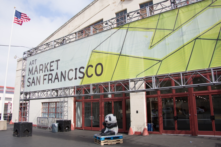
For five days starting on April 29th last month, the Fort Mason Festival Pavilion showcased a rich and varied collection of contemporary art, presented as part of the Art Market San Francisco international fair. The high-energy—and well-attended—show provided the opportunity for art lovers and collectors to engage with some fantastic pieces offered by a diverse group of domestic and international artists (and their dealers).
Welcoming a record 25,000 visitors, Art Market San Francisco (now in its fifth edition) saw all-around strong sales, with acquisitions of six-figure works reported. Unsurprisingly though, I found myself drawn to works of a more whimsical and playful nature, selling for prices more in line with the kind of resources available to average collectors. In what follows, I’ll highlight three artists, in particular, that caught my attention.
Noah Erenberg
“Feverish” is a word that has sometimes been used to describe Noah Erenberg’s use of color. Others, such as Priscilla Frank, have noted Erenberg’s “spontaneity and refreshing lack of self-consciousness.” However you analyze it, Erenberg’s complex, brightly-colored text paintings demand engagement. In part, that’s because of the indisputable authority with which Erenberg’s works combine frenetic jumbles of words, phrases, and doodles, interspersed with splashes of color and patterns.
The Internet cognoscenti might see something akin to a “tag cloud” in Erenberg’s work, that crowd-sourced categorization scheme that organizes much of the information we consume each day. But Erenberg is no techie, and these impressions and associations come from a single, highly-focused mind.
The effect is magical. Seemingly unrelated letters, words, and shapes coalesce into strange, disorderly formations, demanding you to reassess and reorganize, not unlike a puzzle. Considered Outsider Art—that broad categorization that includes self-taught or naïve art—Erenberg has been producing art for nearly 25 years, exhibiting internationally for the past two decades.
Erenberg is represented by Paige Wery, owner and curator of the Good Luck Gallery in Los Angeles’ Chinatown arts district.
Dave Eggers
While Noah Erenberg invites viewers to unravel the connected meaning of his work, San Francisco-based multi-talent Dave Eggers instead strives to deliver his message as unambiguously as possible. Or so it would seem at first glance. Combining a “highway signpost” graphic style with everyday, idiomatic language, Eggers transforms superficially innocent images and expressions into powerful declarations that appear almost propagandistic.
Using a colorful cast of animal actors, printed using silkscreen on paper, Eggers invites viewers to consider the nature of the human condition, as expressed through critters as varied as hares, ferrets, and bisons. Expounding expressions such as “Courage: May it be Common” and “My Sense of the Nearness of Death is Different Than Your Sense of the Nearness of Death,” Eggers’s messages are constructed to slip past our social filters and take root as a new type of understanding.
While impressive as an artist, Eggers is actually better known as an author and publisher, penning the best-selling memoir A Heartbreaking Work of Staggering Genius, and founding McSweeney’s, the literary journal and publishing house. Eggers is also a co-founder of the literacy project 826 Valencia, as well as the founder of ScholarMatch, a program that connects donors with students needing funds for college tuition.
Eggers is represented by the San Francisco-based Electric Works gallery.
Michael Scoggins
Moving from the playful and whimsical, the works of Michael Scoggins tosses a schoolboy’s mischievousness into the mix. Scoggins’s pieces begin as large sheets of paper—many 51 x 67 inches—on which Scoggins adds thin blue lines, a bold red margin, and precisely-cut holes. The result: a paper canvas that looks just like a page from a giant spiral-bound notebook.
It is on this surface that Scoggins then writes and sketches with childlike sensibilities, using age-appropriate implements such as graphite, crayons, and colored pencils. Whether it’s the line “I will learn from my failures” repeated 25 times, or a colored pencil interpretation of Van Gogh’s Starry Night, Scoggins seems to be telling us that one doesn’t have to look too deep to extract the essence of the matter at hand. And as if to punctuate this lack of pretension, many of the pages are crumpled, creased, or cut, as if ripped and discarded from the imaginary notebook.
Scoggins came upon his distinctive style while evaluating his earlier work as a traditional fine art painter. Pouring through his notebooks dating back to his childhood, he was amazed to discover the elegant power and directness of a child’s hand. It’s an outspokenness that continues to inform his work.
Scoggins is represented by Adler & Co. Gallery in San Francisco.